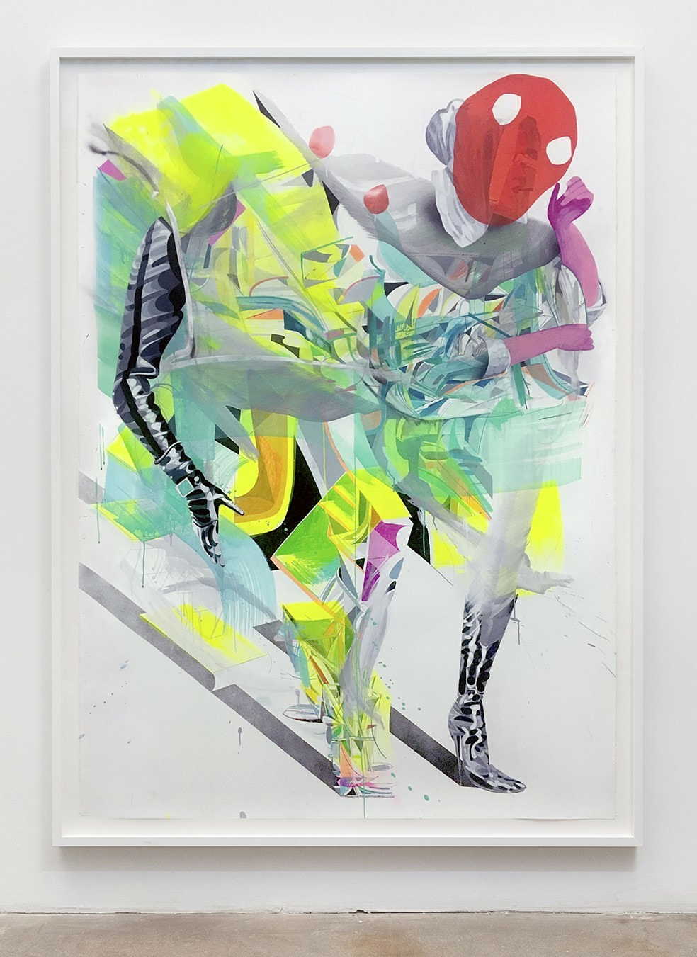
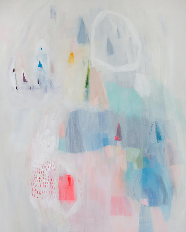
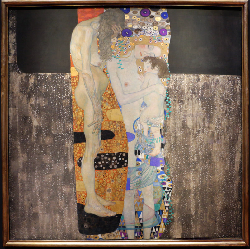
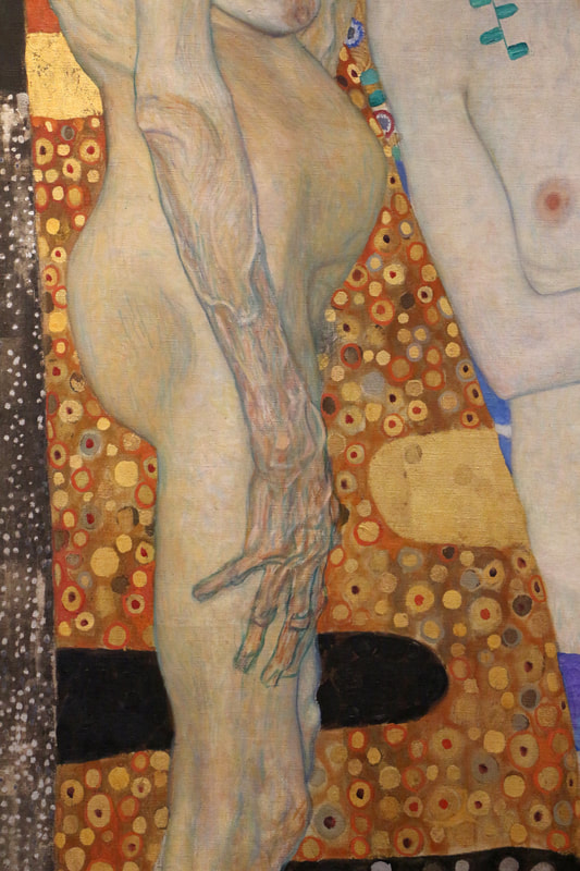
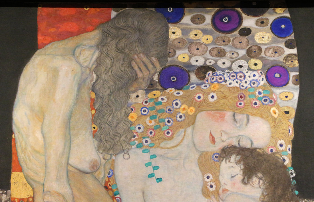
“… lend your ears to music, open your eyes to painting, and … stop thinking! Just ask yourself whether the work has enabled you to “walk about” into a hitherto unknown world. If the answer is yes, what more do you want?”
-Wassily Kandinsky
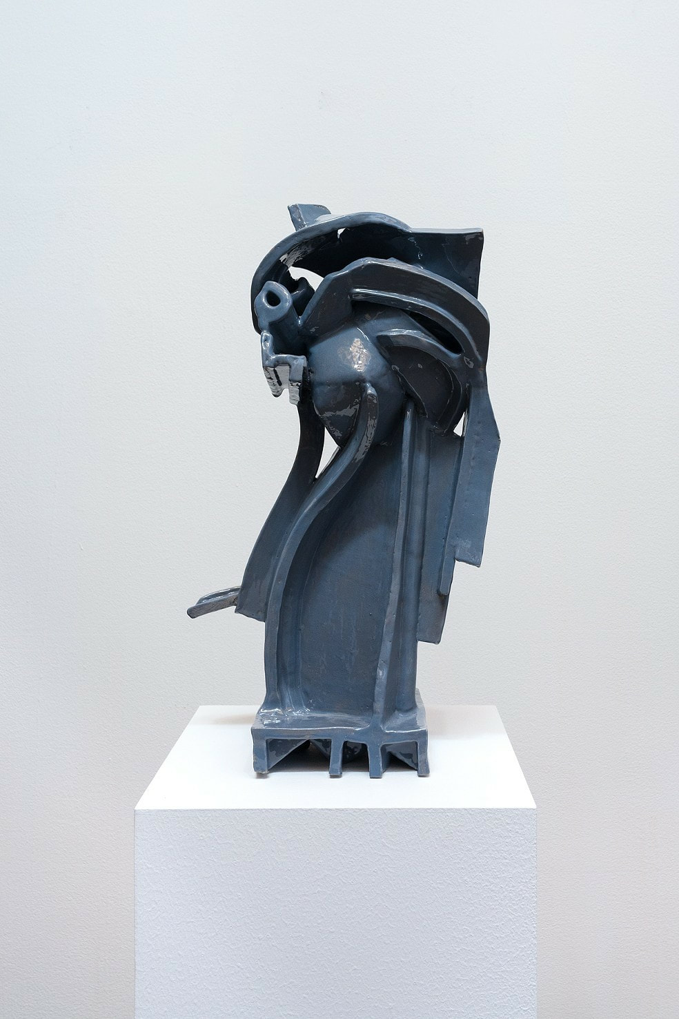
-Wassily Kandinsky

 RSS Feed
